Optimize your checkout experience
We'll show you how you can optimize your checkout experience using its main components and how best to achieve a specific goal, which will result in more sales conversions.
Improve scannability
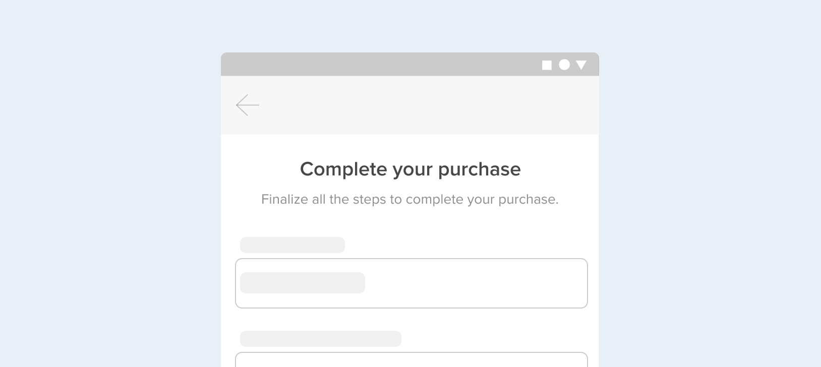
Scannability helps visually navigate the screen and understand the different sections and instances of it. Here are some elements you can add to help scannability and provide context for the user:
Headings, subheadings and explanatory texts
Keep the data grouped thematically and provide context to the user about the steps to follow to complete their transaction. This will help scannability and make the user feel more secure when sharing their information. For this, we recommend you use:
- Headings: use them to group the required details by theme and to indicate the users which section they are in.
- Subheadings: use them to give context or explain which action is expected.
- Explanatory texts: use them to provide explanations or deepen information, whenever necessary, to avoid doubts.
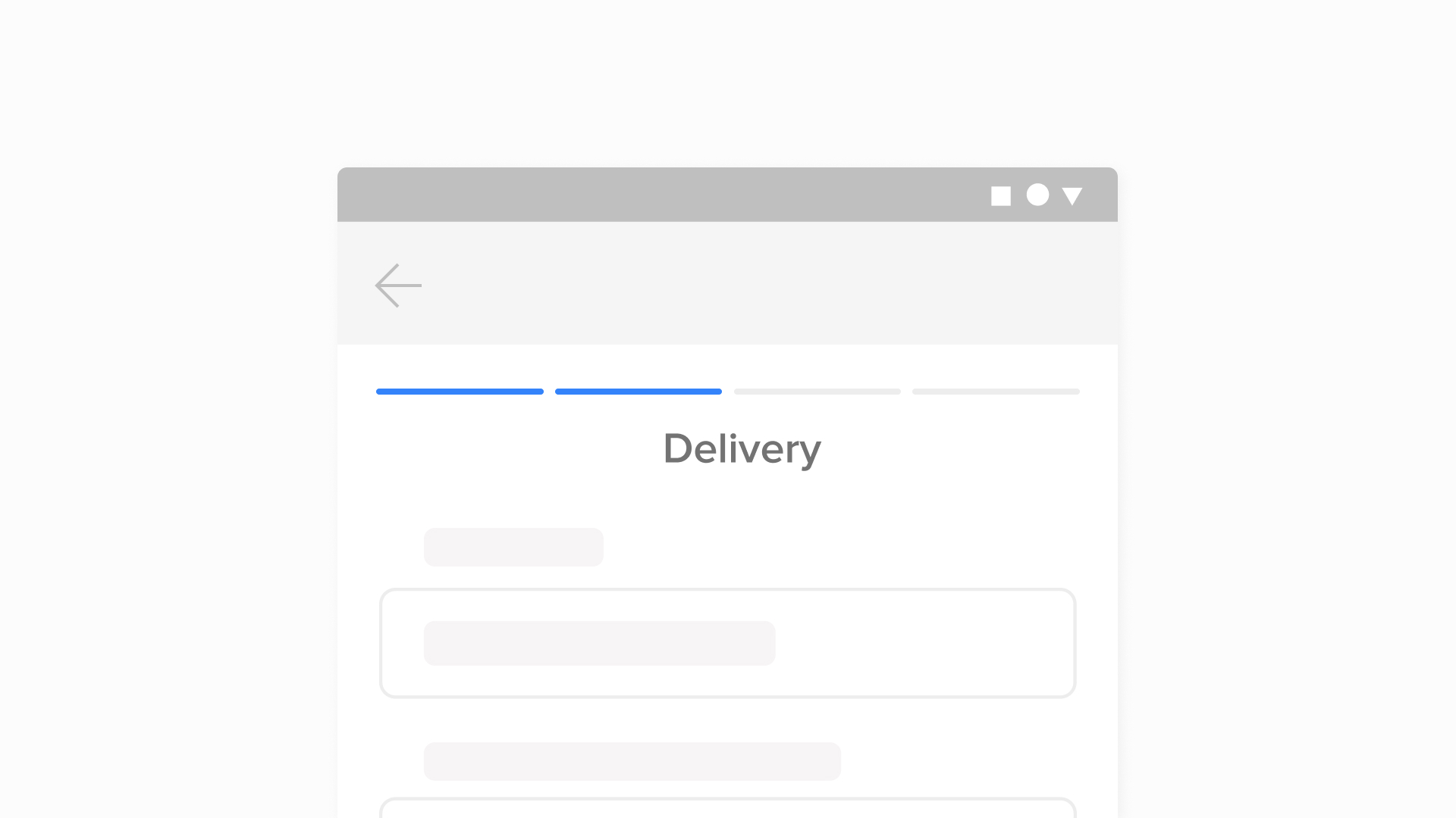
Progress indicator
It is a progress bar that tells the user which stage of your checkout they are in. You can segment it into equal parts, indicating each step of the checkout. In this way, your user will have visibility of the step they are in and how much remains to finish the payment process.
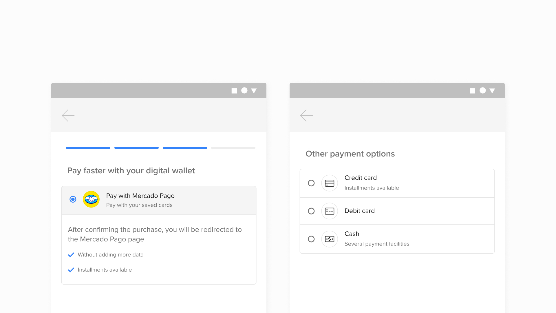
Bullets and highlights
Bullets are a dotted list of different elements. Use bullets to make lists that help you read the information faster. A list causes less cognitive effort than a paragraph.
Highlights are underlined or highlighted text. Use highlights to call attention to important keywords or sentences that add value and make the screen easier to scan.
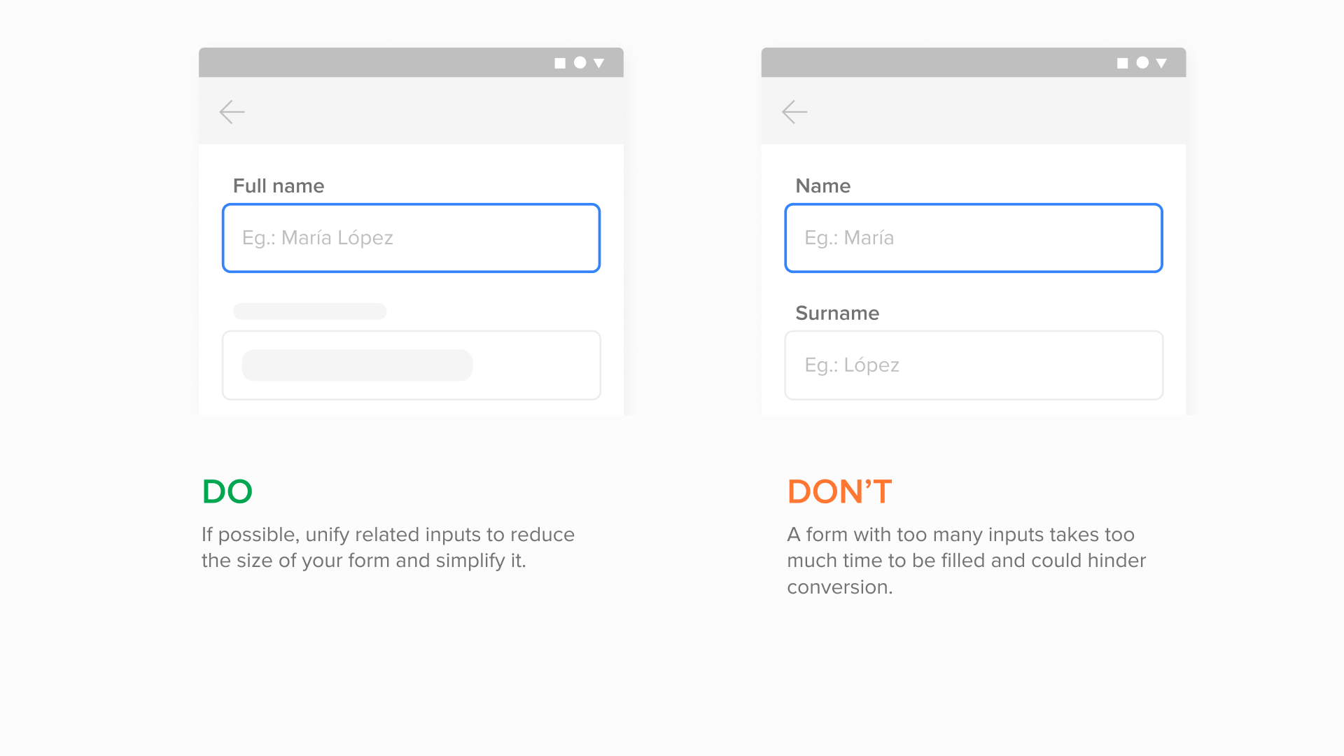
Facilitate data filling
We recommend using forms to collect the data you need from the user. Forms are sets of related inputs that have a common purpose, for example, such as those in which personal data is requested.
In turn, the inputs are fields where the users must fill and edit the required information. They should have a logical order within the form and the required ones should be differentiated from the optional ones. Additionally, they must be long enough so that users can view the information they have entered and easily review and edit them.
In order to make filling out the form easier and not tire the user:
- Use a few inputs per form, use only the essential ones.
- Remove any request of information that is not essential for the purchase process.
- Request each detail only once to avoid being redundant.
Provide context
Labels and placeholders
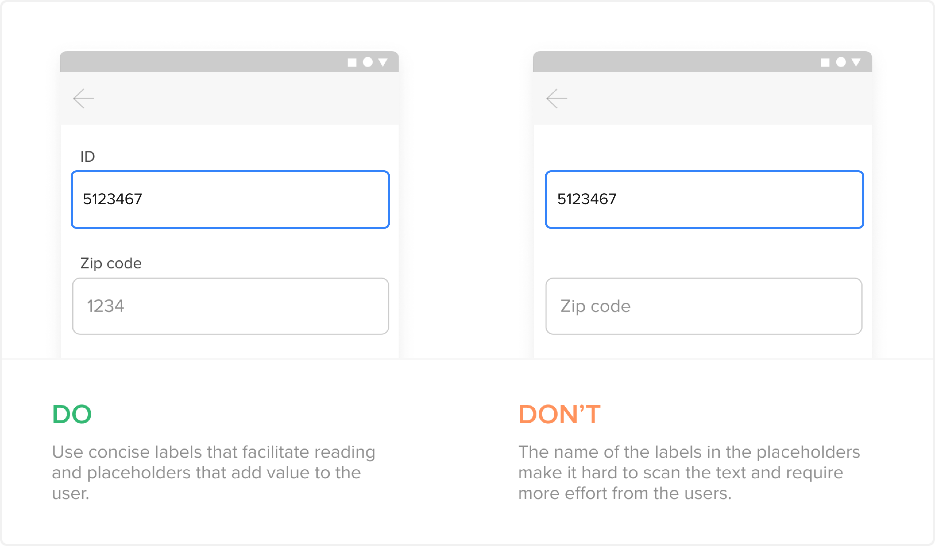
Labels are the names of each input and indicate which detail should be entered. They should be constantly visible so that users can scan and fill out the form faster, since they work as a guide and prevent users from having to remember what information they should enter.
In turn, the placeholders are the filler texts of each input. They serve to exemplify or explain the data to be entered. Take advantage of this instance to place formatting or actionable examples. It is important to know that the placeholder disappears when the cursor is placed on the input or the data is completed. Take this feature into account and avoid using them as the only reference for your inputs so that the user does not have to make an effort to remember what data goes in each field, or has to delete what was entered if they want to confirm it.
Both the labels and the placeholders must be short, direct and clear to prevent users from making mistakes.
Helpers and tooltips
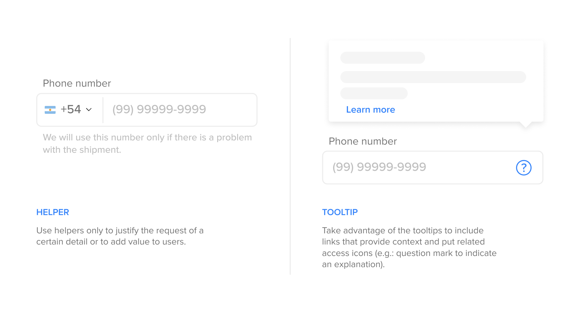
Helpers are the explanatory texts that go below the inputs and allow providing additional information about what the detail is and why it is being requested. Use them to justify the request of sensitive details or give relevant information about the field.
The tooltips are notifications that offer an extra layer of information when the helper is not enough. Use them to add definitions, complementary information or actionables through links.
Success and error messages
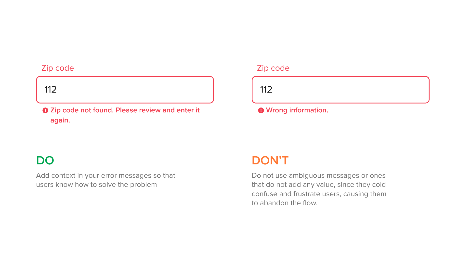
Success and error messages validate the information entered in the inputs. To add emphasis, it is possible to use the green color in the success messages and red in the error ones.
Use success messages only if the confirmation is necessary or if the entered detail adds value to the user (e.g: free shipping or discount). In case of an error, it is important to clarify what the problem was and provide a solution so that the user does not make the mistake again and gets frustrated. If the input has a helper, it should be replaced by the error message.
Add clear actionables
Call to action (CTAs) are calls for the user to perform a certain action. They allow performing the main and secondary actions of a page and can be applied in different styles, such as buttons, icons or links, with different hierarchies and in different places, such as cards and tootltips, among others.
Here are some tips:
- Use contrasting colors so that the CTAs can stand out and be differentiated from the page background.
- Make sure they are clear and direct in order to provide context.
- Use buttons for the main actions and write them in the infinitive verb tense so that there is no ambiguity.
- Add links for secondary actions that add context and make sure it is a self explanatory text that makes reference to where the users are being redirected to.

Highlight the options
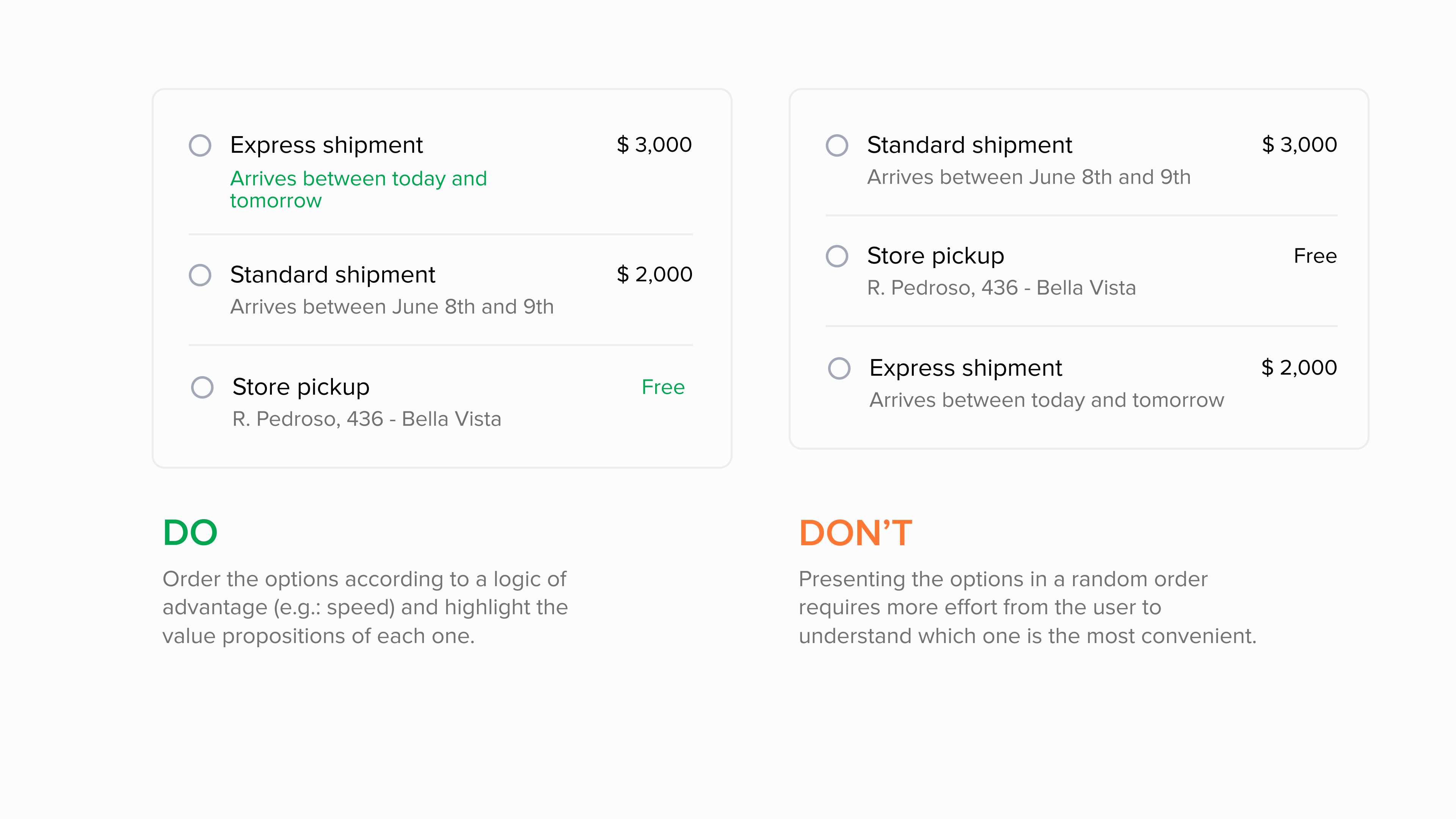
In a checkout, the user must choose between different options throughout the payment process, such as the type of delivery, payment methods, number of installments, among others. In this process, the conversion can vary according to different factors and the context of each one.
Therefore, offer options that include different possible variables and write them in descending order, taking into account the most used or beneficial for your customers. However, we recommend offering only the most common ones because otherwise you can confuse and hinder the selection process.
- Use radio buttons when there are few options and you can only choose one of them
- Offer dropdowns when there are several options and you don't want to take up so much screen space
- Use cards when it comes to visual options, among others.
In addition, you can add the most outstanding value propositions in each option to help the user have more information to make a decision.
Skip the unnecessary steps
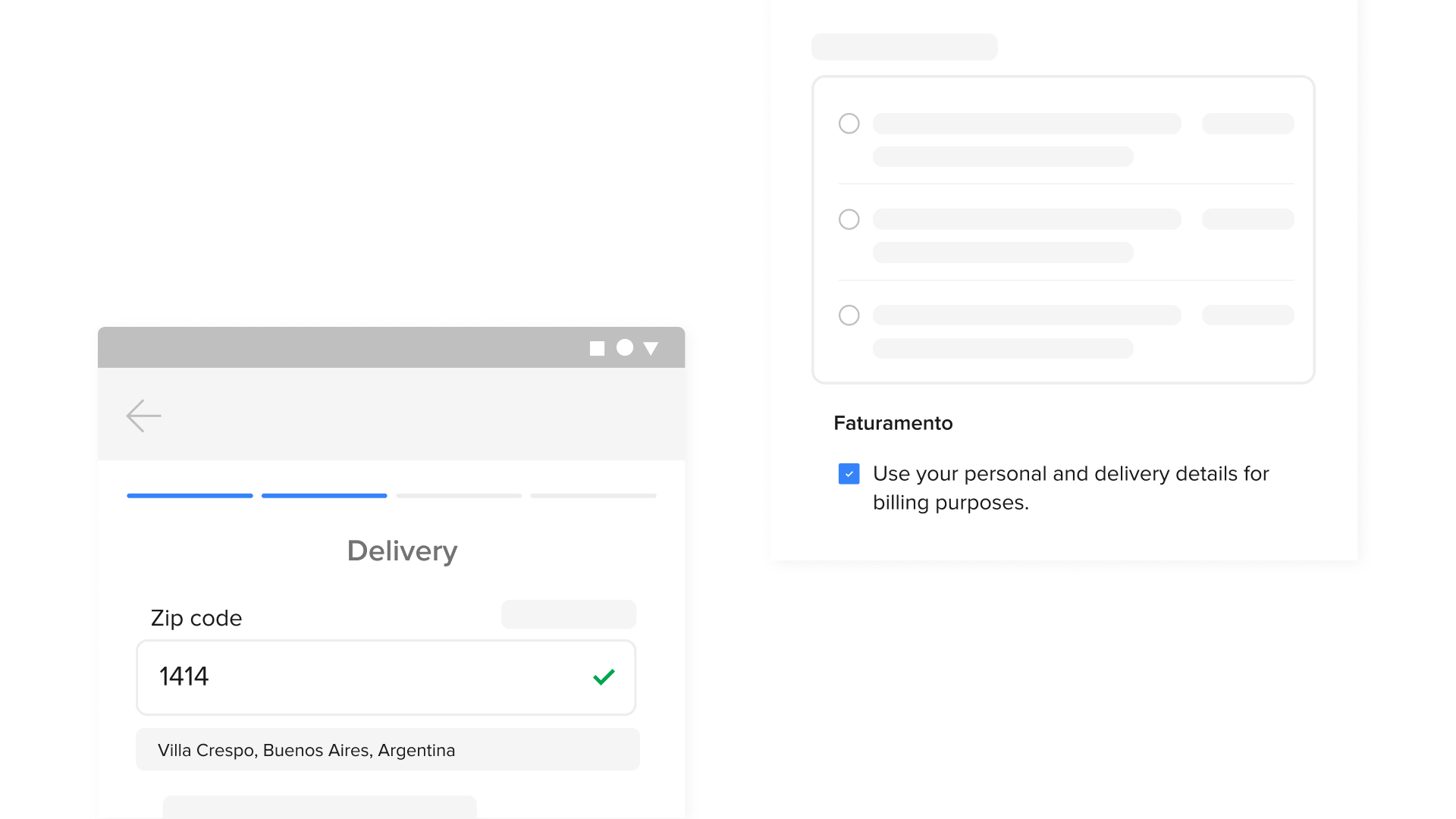
Avoid asking for repeated data or data that is not necessary to complete the purchase. To do this, take advantage of the steps where required details are requested to get information you will need later.
For example, you can use the personal and shipping information to get the billing details. This way you will avoid adding an extra form that slows down the payment process.
Give visibility during the process
Add a fixed summary component or a direct access to the shopping cart that shows the total price to pay according to the actions that the user is performing.
Although most users review their purchase at the end, they feel more secure if they can control what they are doing throughout the process.
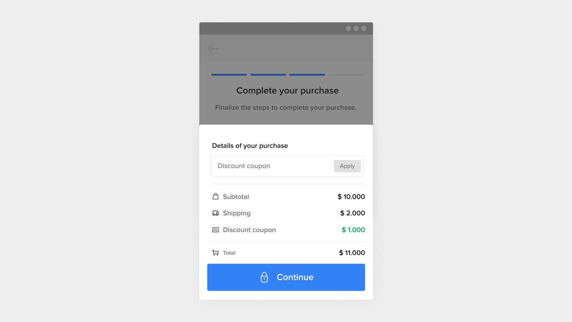
Also, before finalizing the purchase, allow your users to review the entire process and the final price. For this, add a confirmation or review page, prior to making the payment, that includes a summary of all the decisions made, all the information uploaded and the detail of the total to pay. It is important to give the possibility to edit any of the data from there, without the need to go back to the previous steps.

